Design System / 05.3
Structure
How content is organized: hairline accordions and tables, editorial and service cards, pagination, sticky chapters, and a list–grid switch.
Accordion
Generalized disclosure rows over hairline dividers — single- or multi-open, with a rotating plus or flipping chevron. Opens on the entry curve, closes faster on the exit curve.
Plus, single-open
Chevron, multi-open
- items
- { title, content }[]
- Keys off title, so titles should be unique. Uncontrolled by design.
- multiple
- boolean = false
- Allow several panels open at once.
- icon
- "plus" | "chevron"
- Default "plus" (rotates 45°); chevron flips 180°.
SpecAccordion (below) remains the spec-sheet variant.
Index table
Columned hairline rows in uppercase for archives and directories. Linked rows ghost to 15% presence on hover; external URLs are auto-detected and get a stroke arrow plus target="_blank".
- columns
- string
- Raw grid-template-columns shared by every row.
- rows
- { cells, href? }[]
- cells is one ReactNode per column; rows without href are static and do not dim.
Hover preview list
The signature menu interaction: text rows that reveal a fixed image in a viewport corner. The preview mounts only for fine pointers — on touch devices the rows simply stand alone.
- Lorem Ipsum12
- Dolor Sit Amet9
- Consectetur14
- items
- { label, detail?, imageSrc? }[]
- Rows are non-interactive; rows without imageSrc show no preview.
- position
- "top-left" | "top-right" | "bottom-left" | "bottom-right"
- Viewport corner for the preview slot, default "top-right".
- size
- number = 150
- Square preview size in px.
- offsetX / offsetY
- number = 15
- Edge insets — bump offsetY to clear a fixed nav.
Editorial card
Story and news cards: numbered index, monochrome photograph, dim meta row, then the title. Hover either dims the image further or lets a little color back in.
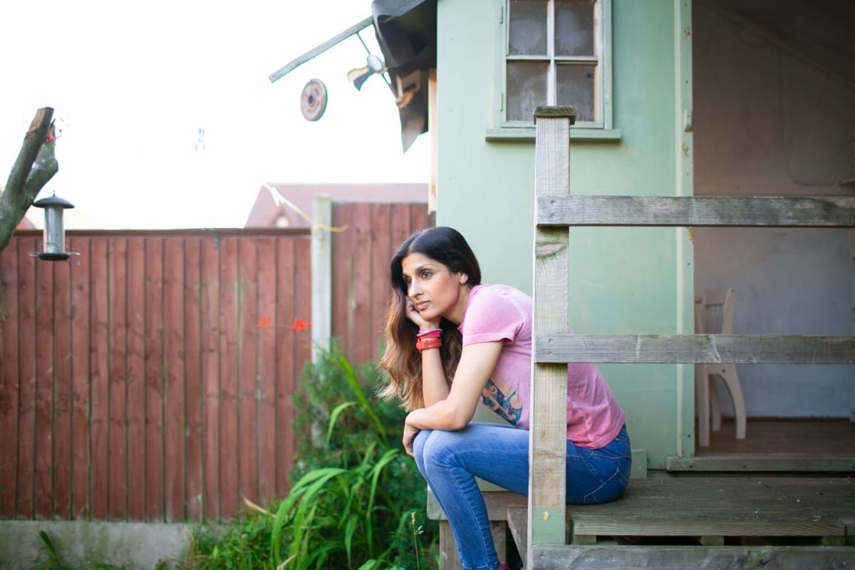
- href / title / imageSrc
- string
- The whole card is one anchor.
- index
- number?
- Zero-padded counter; feed your map index for auto-numbering.
- meta
- string[]?
- Dim uppercase metadata row.
- hover
- "dim" | "color-return"
- Default "dim" (brightness drop); "color-return" adds partial saturation and a slight scale.
Service card
A flat, hairline-bordered card: title, optional geometric glyph in currentColor, body copy. Hover thickens the border to the interactive weight — never a shadow, never a fill.
Lorem Ipsum
Dolor Sit
- title
- string
- Card heading.
- glyph
- ReactNode?
- Decorative 20px slot, aria-hidden — keep strokes at currentColor.
- children
- ReactNode?
- Body copy.
Prev / next
Entry-to-entry pagination under a hairline top border: eyebrow, title, stroke chevron. A missing side keeps its slot so the other stays on its edge.
- prev / next
- { href, title, eyebrow? }?
- Eyebrows default to "Prev" / "Next". Wrapper is <nav aria-label="Pagination">.
Sticky stack
Chaptered sections that pin and stack as you scroll — each sticky panel slides over the last on escalating z-index with a hairline top rule. Pure CSS positioning, no script.
Lorem
Ipsum dolor sit amet, consectetur adipiscing elit.
Dolor
Sed do eiusmod tempor incididunt ut labore.
Amet
Ut enim ad minim veniam, quis nostrud.
- top
- number = 0
- Shared sticky offset in px — set it to your fixed-nav height.
- children
- StickyStackSection[]
- Sections receive escalating z-index; per-section top / zIndex props win.
- className (section)
- string?
- Sections default to min-h-[70svh] paper — override height and padding here.
View switch
A text-only List — Grid switcher: the inactive option rests at 60% presence and restores on hover. Controlled and generic over its option strings.
- Lorem Ipsum
- Dolor Sit
- Amet Consectetur
- Adipiscing
- options
- readonly T[]
- Option labels; T extends string, so union state typechecks.
- value / onChange
- T / (v: T) => void
- Controlled pair. Buttons carry aria-pressed.
Spec bar
- lorem:
- Ipsum Dolor
- sit:
- Amet 24
- consectetur:
- 2026
SpecBar — entry metadata as mono label/value pairs over a hairline; on article pages it stays pinned beneath the header for the whole scroll (static here for display).
Spec accordion
SpecAccordion — the spec-sheet variant: hairline rows with a 1px-stroke plus icon; opens on the entry curve, closes on the exit curve.
Information bar
InfoBar — 19px three-column strip with truncating cells and a hairline base; used under heroes and above footers.
Page furniture
New York City ● --:--:--
Clock — a live local-time stamp for the footer’s bottom line.
StatusDot — a currentColor dot with a slow 2s blink beside a mono label; the quiet way to say something is live.