Design System / 07.7
Overlays
Layered controls for dialogs, menus, contextual help, media annotation, and image hotspots. CustomCursor is an optional site-level effect.
Custom cursor
A rare, opt-in site layer for a fine pointer. The squared follower uses the fixed media-paper token with difference blending, dims over interactive targets, and can show a short label from a data attribute. The mark follows promptly while that label trails at a slower rate; the finite loop sleeps after both settle. Coarse pointers and reduced motion keep the native cursor. Enable this specimen deliberately because the component acts at document scope.
Live specimen
Rendered output
Checking pointer and motion preferences
API reference
Inputs, types, and behavior
- InputclassName
- Typestring?
- BehaviorMerged last onto the full-viewport, aria-hidden layer; override currentColor there if the media needs another fixed cursor value.
- Inputdata-cursor-label
- Typestring attribute
- BehaviorRead from the nearest hovered ancestor and rendered in a squared paper chip; blank values are ignored.
- Inputplatform gate
- Typefine pointer + no reduced motion
- BehaviorEvaluated live with media-query change listeners. Native cursor hiding starts only after the first pointer move and is always cleaned up.
// Render once near the site root, only when the effect is justified.
<CustomCursor />

<a data-cursor-label="View project" href="/projects/case-01">
  Case 01
</a>Drawer
A portal-backed modal panel from the right or top. Both variants enter in 550ms; right exits in 300ms and top in 400ms using transform only. The scrim fades independently. The chosen edge is latched through exit. While present, the drawer contains focus, makes body siblings inert, locks document scroll, and restores the opening control.
Live specimen
Rendered output
API reference
Inputs, types, and behavior
- Inputopen / onOpenChange
- Typeboolean / (open) => void
- BehaviorControlled. Escape and the scrim request close; repeated dismissal is guarded while the retained exit finishes.
- Inputlabel
- Typestring
- BehaviorRequired accessible dialog name; a blank runtime value falls back to Drawer.
- Inputside
- Type"right" | "top"
- BehaviorDefaults to right. Right is full width on phones; top is a shallow viewport band. The edge is latched for the mounted lifecycle, including an interrupted exit; children remain live.
- Inputchildren / className
- TypeReactNode / string?
- BehaviorPanel content and a panel override merged last. Add a visible close action; data-dialog-initial-focus marks the preferred first focus target.
Glass tooltip
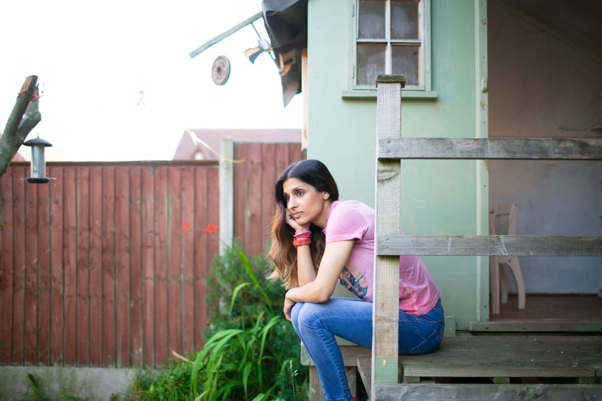
A static caption surface for photography, not decorative glass on paper. Fixed media-ink and media-paper tokens preserve its contrast across page themes; a hairline and light blur separate the caption from the image.
Live specimen
Rendered output
API reference
Inputs, types, and behavior
- Inputchildren
- TypeReactNode
- BehaviorReadable caption or annotation content. Keep it brief.
- InputclassName
- Typestring?
- BehaviorMerged last on the surface for contextual position or width.
Hotspot map
Squared 44px marks over media. Fine hover and keyboard focus preview one caption; activation pins it, a second activation or outside press closes it, and Escape works from the mark or caption content. Coordinates clamp to 0–100%; non-finite values settle at 50%. The rendered anchor then insets by half a target at an edge, keeping all 44px clickable. Edge captions turn inward and above instead of clipping.
Live specimen
Rendered output
API reference
Inputs, types, and behavior
- Inputhotspots
- Type{ x, y, label, content }[]
- Behaviorx/y are percentage positions. Labels name controls; duplicate labels are safe because IDs and keys also use index.
- Inputchildren
- TypeReactNode
- BehaviorImage or media. Closed caption descendants are inert and cannot remain in the Tab order.
- InputclassName
- Typestring?
- BehaviorMerged last on the positioned, overflow-clipping container.
Modal
A portal-backed modal dialog with a squared paper panel and static 3px scrim blur. It fades in over 600ms and exits over 400ms. Focus is contained and restored, body siblings remain inert through exit, and ref-counted locking keeps nested layers from releasing document scroll early. The specimen includes a real nested modal.
Live specimen
Rendered output
API reference
Inputs, types, and behavior
- Inputopen / onOpenChange
- Typeboolean / (open) => void
- BehaviorControlled. Escape and scrim clicks request false only while open; internal presence preserves the exit.
- Inputlabel
- Typestring
- BehaviorRequired accessible dialog name; a blank runtime value falls back to Modal.
- Inputchildren / className
- TypeReactNode / string?
- BehaviorDialog content and a panel override merged last. Mark an initial control with data-dialog-initial-focus when document order is not sufficient.
- InputoverlayClassName
- Typestring?
- BehaviorMerged last on the full-viewport centering layer; LoginModal uses it for an edge-to-edge mobile sheet.
Popover
A non-modal dialog anchored above or below its 44px trigger. The paper panel uses a hairline, viewport-safe width, and paired 300/200ms transform-and-opacity motion. Focus moves to the panel; Escape restores the trigger, while blur or an outside press closes without stealing the destination’s focus.
Live specimen
Rendered output
API reference
Inputs, types, and behavior
- Inputtrigger / children
- TypeReactNode / ReactNode
- BehaviorBuilt-in uppercase trigger content and freeform non-modal panel content. Pass triggerLabel when the trigger has no readable text.
- Inputlabel
- Typestring
- BehaviorRequired accessible dialog name; a blank runtime value falls back to Popover.
- Inputposition / align
- Type"bottom" | "top" / "left" | "right"
- BehaviorBoth default to the first value. There is no automatic collision detection or portal; choose fitting edges and avoid clipping ancestors.
- Inputopen / defaultOpen / onOpenChange
- Typeboolean? / boolean? / callback?
- BehaviorUse open with onOpenChange for controlled visibility, or defaultOpen for uncontrolled initial visibility.
- InputclassName
- Typestring?
- BehaviorMerged last on the wrapper; panelClassName and triggerClassName target each half.
Tooltip
A portal-backed, non-interactive explanation for compact controls and analytical marks. Hover opens after a short delay; keyboard focus opens immediately, Escape dismisses, and viewport collision flips the requested side when needed. The trigger retains its own semantics through aria-describedby.
Live specimen
Rendered output
<Tooltip content="Measured after the final evaluation pass." side="top">
  <button type="button">Data freshness [?]</button>
</Tooltip>
API reference
Inputs, types, and behavior
- Inputchildren / content
- TypeReactElement / ReactNode
- BehaviorOne semantic trigger and a brief, non-interactive explanation. Blank content does not open.
- Inputside / align
- Type"top" | "right" | "bottom" | "left" / "start" | "center" | "end"
- BehaviorRequested placement and cross-axis alignment; the opposite side is used when it is the only fit.
- Inputdelay / gap
- Typenumber
- BehaviorPointer delay defaults to 450ms and clamps to 0–1500ms; gap defaults to 8px and clamps to 0–32px.
- InputclassName / tooltipClassName
- Typestring? / string?
- BehaviorOverrides for the inline anchor wrapper and squared paper tooltip surface, both merged last.