vvver uses warm ink and paper, disciplined type, specific metadata, selected photography, and restrained motion. Context comes from the subject and its production details, not simulated wear.
Human traces include a hand, a marked-up proof, a date, a worn material, a handwritten correction, or a production note. Decorative damage does not provide the same context. Identity also depends on scale, spacing, adjacency, and source quality.
Editorial
Composition establishes hierarchy before component chrome does.
Selective
Use one clear visual decision instead of several simultaneous effects.
Documented
Dates, scope, captions, status, and provenance must describe the work.
Physical
Photography may retain grain, blur, uneven light, and marks of use; interface surfaces stay clean.
Technical
Registers and notation label real values and records, never a fictional terminal.
Independent
References inform principles and measurements; their identity is not reused.
Use these principles to resolve competing priorities. They define what the system protects before describing its appearance.
Apply them when expression competes with clarity, density with legibility, novelty with familiarity, or motion with directness. A result should not depend on the logo or a texture layer.
Operating standard / 08 principles
Start with the task, preserve user control, and support every claim.
Principle01
Serve the work
Begin with a named user task.
Name the person, their goal, the information they need, and the first useful action before choosing a layout or effect. A new visual treatment alone does not justify a component.
Review tests
↳State whose goal the design serves.
↳Put the first useful path before promotion.
Principle02
Keep control with the person
Let people initiate, pause, reverse, and leave.
Keep current state and likely consequence visible. Guided sequences may clarify necessary work, but they must not trap someone inside a performance; recovery should cost as little time and work as possible.
Review tests
↳Expose state, consequence, and available action.
↳Make pause, exit, and recovery inexpensive.
Principle03
Support every claim
Show where a result came from.
Provenance, scope, status, limitations, permissions, and uncertainty belong in the interface. Never invent authority, urgency, measurement, or production history; provide a source, trace, receipt, or exact value.
Review tests
↳Name what acted and what could change.
↳Keep sources and limitations next to the result.
Principle04
Build on learned behavior
Be familiar before being distinctive.
Use native semantics and established interaction models before inventing controls. Distinction should come from rhythm, proportion, material, and language, not surprising navigation or renamed controls.
Review tests
↳Use the expected element and keyboard model.
↳Apply one behavior consistently everywhere.
Principle05
Preserve meaning across contexts
Adapt without losing purpose, order, or state.
A phone is not a compressed desktop. Width, theme, content length, keyboard, touch, pointer, assistive technology, and reduced motion are parallel ways into the same product and must retain equivalent meaning.
Review tests
↳Keep the reading sequence truthful in source order.
↳Preserve state and action across input methods.
Principle06
Remove until hierarchy reads
Simplicity is focus, not emptiness.
Keep what the task needs, then remove competition around it until importance, sequence, and consequence are clear. Every rule, texture, label, animation, and alternate type voice must earn its place.
Review tests
↳Keep primary information and action close.
↳Remove any accent that competes with the work.
Principle07
Judge the implementation
The rendered state is the design.
Review wording, alignment, measure, semantics, focus, touch size, loading, failure, and reduced motion. Inspect the browser result at relevant widths and in both themes.
Review tests
↳Inspect representative content, states, and constraints.
↳Maintain the quality bar after shipping.
Principle08
Use real human traces
Let details show use, time, and care.
A precise caption, believable material, forgiving transition, clear empty state, useful receipt, or trace of work can add character. Glow, bounce, fake grain, and synthetic damage cannot replace those details.
Review tests
↳Tie every expressive moment to the purpose.
↳Prefer a trace of real use to decorative personality.
+Hierarchy reads — correct
Outstanding
$4,280
Due in 12 days · Acme Co.
Review →
One reading order: label, figure, context, action. Emptiness is structure.
×Everything competes — avoid
OutstandingUrgent
$4,280+12%
Acme12 daysNet-30
Review now
Borders, badges, shadow, bold, and color fight for the same attention.
The V// symbol and VVVER name are the catalog’s owned identity. Four fixed bars form one continuous gesture: a V that carries forward into two slashes. The silhouette is inherited, not redrawn, distressed, outlined, or reconstructed from type.
The generic Wordmark component supplies lockup structure and optional scroll compaction. It does not supply this mark; consumers bring their own symbol and name.
Drawing field
42 × 32 / four fixed paths / currentColor
Full lockup
Symbol + uppercase VVVER / 0.6rem gap / 0.14em tracking
Standalone symbol
Browser icons, install assets, or compact navigation after the name is established
One unit in currentColor: ink on paper, paper on ink.
×Boxed, shadowed, recolored — avoid
No container, drop shadow, outline, or alternate-color artwork.
Preserve the drawing field and the relationship between symbol and label. Scale the lockup as one unit; do not add a container, texture, shadow, or alternate-color artwork.
Choose material from the subject: paper, cloth, wood, plaster, stone, glass, metal, ink, skin, flour, directional light, and the wear of real use. Prefer hands working, objects in context, proofs on desks, signage in place, and screens inside actual environments.
Preserve differences between sources. A photocopied proof, clothbound object, painterly image, and grain-heavy photograph should not all be forced through one monochrome filter. The image owns its crop, aspect, color, and alternative text; the system owns the sequence around it.
Material study / Paper / Static field
Texture belongs to a material.
Preserve the source image's color, grain, crop, and uneven light.Catalog fixture / demo.jpg / 1200×800
+Source preserved — correct
Color, grain, crop, and uneven light stay as shot.
×Forced through one filter — avoid
A global monochrome-and-grain preset erases what the source actually was.
+Keep
Genuine paper fibers, optical softness, uneven light, production marks tied to production, object-specific wear, and accurate captions.
×Reject
Animated grain, random distress, universal filters, novelty stamps, fake dates, invented plate numbers, and texture applied globally to imply age or production history.
Surface roles
Material names a credible substrate. Pattern organizes space. Moving marks are effects, never material. Use one layer per region; if it reads before the content, it is too loud.
The photographic direction favors dimensional, tactile scenes. It is not tied to one film stock or muted preset. Window light, amber interiors, direct flash, vivid color, and grainy black and white can coexist when the light is believable and each color belongs to the subject.
“3D pop” describes tonal separation, not a palette. Preserve it at three scales: the subject, its material, and its fine detail. Local contrast gives the focused plane presence; sharpening, global contrast, and background blur cannot imitate it.
Microcontrast
Fibers, skin texture, grain, and surface transitions separate cleanly without clarity halos or digital crunch.
Dark separation
Black remains black, while almost-black retains enough tonal difference to reveal depth and material.
Highlight roll-off
Bright areas remain luminous without losing surface detail; broad clipping is acceptable only when direct flash causes it.
Natural depth
Light, tone, color, and spatial layers separate the subject. Blur may assist but never carries the effect alone.
Let color belong to the light, the object, and the moment—never to a preset pasted over them.
— Image direction
[01]
Portraiture
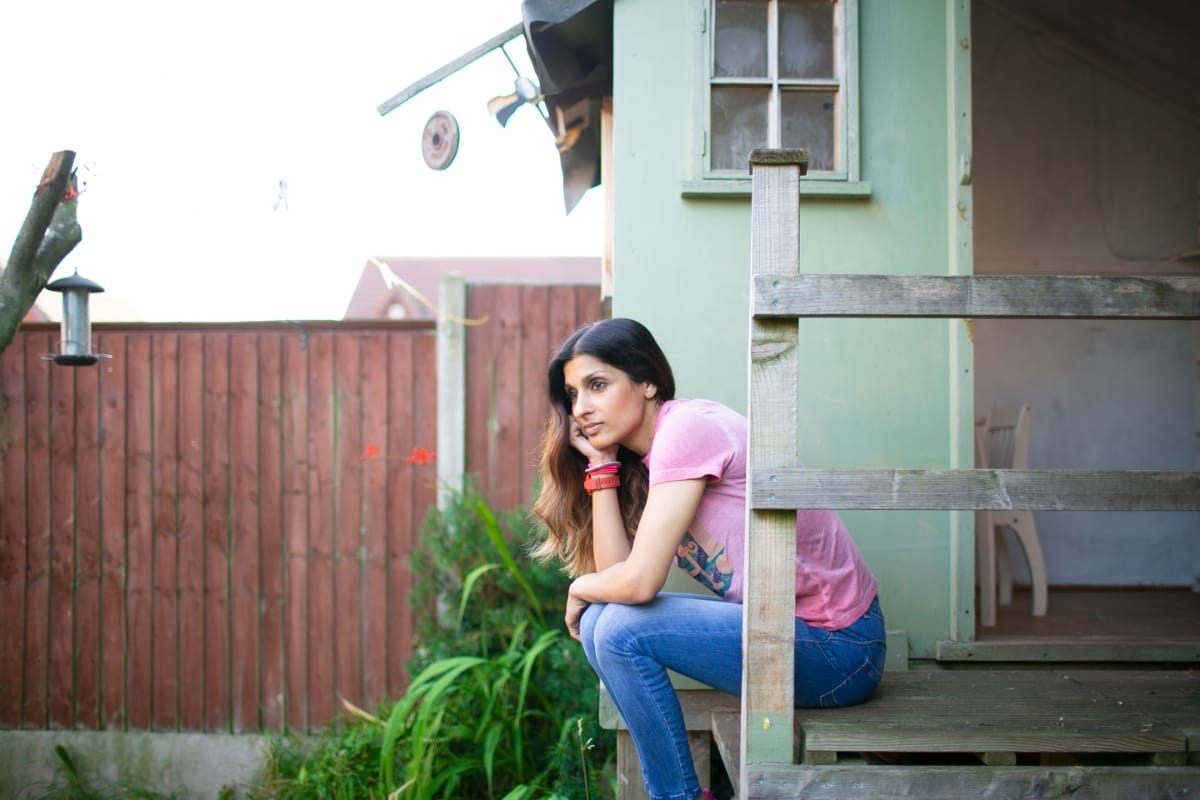
Place a person or animal in an identifiable environment during an action. Keep skin plausible, hands correct, and clothing and tools appropriate to the setting.
[02]
Objects
Show objects in use or in their normal setting. Pair unlike surfaces and retain fibers, seams, wear, fingerprints, condensation, and physically consistent reflections.
[03]
Environments
Build foreground, middle distance, and background around one legible light event. A set table, open door, tool, cable, or worn threshold can supply the human trace.
Color logic
One dominant temperature. One grounded counter-color. Complete tonal range.
Choose one readable light condition: cool overcast, warm window light, tungsten amber, clean daylight, or direct flash. Let saturation come from a physical source—skin, cloth, foliage, paint, food, glass, or metal. Vivid red, blue, or green can lead when the scene contains it; do not impose a teal-orange split.
Keep a convincing neutral reference unless the light is intentionally monochromatic. Avoid blanket beige, cyan shadows, cream-colored highlights, lifted grey blacks, and flare that erases shadow separation. Black and white needs a complete tonal range and a decisive shape or gesture; it cannot repair weak color.
+Dominant + counter + neutral — correct
One warm dominant, one grounded cool counter, and a true neutral reference.
×Imposed teal-orange split — avoid
A preset split pasted over the scene, tied to no physical light source.
Sixteen-frame family
01
Atmosphere
A lead image that establishes place, light, and emotional temperature.
02
Environment
A wider view with a distinct foreground, subject plane, and background.
03
Work
A believable gesture or task that shows the system being used.
04
Material
A close detail where fibers, grain, wear, or reflections carry information.
05
Brand carrier
One exact mark on a useful object or code-native application; generated geometry is never source artwork.
06
Interface / record
A display, proof, order, sample, or register showing a real task or state.
07
Counterframe
One sharper change of register: direct flash, harsher light, or reduced context.
08
Aftermath
The state left when the action is over; no posed subject is required.
09—16
Study-specific practice
Eight additional frames trace the operating lifecycle of the subject, from opening or intake through maintenance, handoff, review, and retention. Their roles differ by study.
Frames 01–08 are shared anchors. Frames 09–16 follow the study’s own operating lifecycle—service day, calibration, edition route, field custody, research review, or market session. Keep one physical logic and material palette across all sixteen while varying distance, orientation, density, and camera behavior. One frame may carry an exact mark; the other fifteen must establish the identity through the scene.
Generation prompt
vvver-image-prompt.txtprompt
Photograph [named subject] [performing a named action] in [named environment]. Frame it from [viewpoint] as [portrait / object / environment], with [foreground detail], [subject plane], and [background detail]. Light the scene with [one primary source] at [time/condition], producing [falloff and shadow direction].

Optical character: preserve fine-detail microcontrast on [important material or feature], clear separation between black and near-black, luminous highlights with retained texture, and natural depth from light, tone, color, and spatial layering rather than cutout blur. Use [dominant temperature] with [counter-color] only in [physical source]. Keep skin and neutral materials plausible; avoid a global color cast.

Physical detail: [fibers, grain, wear, condensation, fingerprints, wrinkles, weather, or another trace tied to the subject]. Lens and exposure: [35 / 50 / 85] mm perspective, [moderate / shallow] depth of field, fine grain, gentle highlight roll-off, and minimal sharpening. Use documentary framing, correct anatomy, and physically consistent light and reflections.
vvver-brand-image-prompt.txtprompt
Use one branded frame in a sixteen-image family. Carry the identity through material, light, crop, interface behavior, and traces of use in the other fifteen. Prefer a code-native carrier when exact geometry matters. If the mark appears in a photograph, place it once on an instrument, edition, field folio, service artifact, or record, and supply the owned artwork as a reference. Preserve its geometry, orientation, topology, perspective, ink or engraving behavior, and surface interaction. Do not paste a logo over an unrelated scene, redraw it, repeat it, or surround it with invented copy. Inspect every stroke at full resolution; reject or repair altered marks, generated lettering, ruler gibberish, and pseudo-labels.
Six fictional organizations apply the same design rules to different sectors. Each study has its own page with mark, voice, material, pattern, interface, application, photography, generation, and rejection guidance.
Each study uses sixteen frames with sector-specific subjects and tasks. The set contains 93 photographs and three code-rendered carriers; those carriers preserve the café, research, and markets marks exactly.
06Studiesone per sector
96Calibrationsixteen roles per identity
93Photographyframes
06Brand carriersthree photographic, three code-rendered
Do not average these identities into one look. Reuse the decision structure—mark ownership, working interface, type roles, material, physical color, human traces, and one counterframe—not their subjects, marks, palettes, or props.
Semantic ink and paper tokens do nearly all interface work. Drawn elements inherit currentColor; hairlines usually sit at 15% ink. Muted tints stay on small local marks, while photography may keep its color.
Rule02
Squared, open geometry
Alignment, negative space, and rules make structure. Brand surfaces have square corners, no shadows, and no perimeter unless a boundary carries meaning.
Rule03
Typography as roles
A primary grotesque carries the page. The catalog uses Switzer, Geist Mono for code, Crimson Text for serif, and Saira Semi Condensed as a rare accent; one composition uses at most one counter-register.
Rule04
Editorial sequence
A tall lead, weighted diptych, inset media, labeled ledger, and numbered work register create pace. Uniform card grids flatten importance and are the exception.
Editorial composition
Establish the setting, show the work, then change scale.
Large empty areas are active structure. They do not need filling simply because a conventional dashboard would fill them.
01 / Full lead / establish atmosphere
02A / Subject
02B / Detail
03 / Inset detail / change pace
Sequence diagram. Media owns crop and content; layout owns only rhythm, balance, and source order.
Interaction reduces presence. Hover and press step down the opacity ladder rather than brighten, glow, or inflate. When a link contains important metadata, dim its image or decorative region while leaving the label legible. Persistent states may remain full ink.
Static is a valid state. Use motion only to explain arrival, departure, hierarchy, or continuity. Only transform and opacity interpolate, and every animation supplies a reduced-motion path that presents the complete result.
+Dims — correct
Hover and press step down the opacity ladder; presence recedes.
×Brightens — avoid
Brightening, glowing, or lifting inflates presence — the system never rewards interaction this way.
Hover / press
Step down the opacity ladder without taking readable information below /60.
Focus
A visible 1px currentColor outline with a 3px offset.
Direct feedback
--ease-out-quint, no more than 400ms, transform and opacity only.
Exit
The faster --ease-in-quad curve, retreating toward the interaction origin.
Reduced motion
A stable, complete final state—not a partially hidden composition.
Contrast, focus, semantics, touch size, source order, and reduced motion are part of the composition—not checks applied after it. Small grey text that cannot be read is not refined; an invisible focus state is not minimal.
Readability
Normal text meets WCAG AA; /60 ink is the minimum readable opacity.
Focus
Keyboard focus remains visible instead of being removed for visual quiet.
Touch
Interactive targets hold a 44px minimum even when the drawn mark is smaller.
Source order
Phone layouts simplify without changing the meaning or reading sequence.
Motion
Reduced-motion states are static, complete, and equivalent in meaning.
+Visible focus — correct
Focused control
A 1px currentColor outline offset by 3px marks the keyboard location.
×Suppressed focus — avoid
No focus ring
outline: none with no replacement leaves keyboard users with no location.
Decision test
Use these questions before adding or approving a component. Several negative answers mean the composition needs refinement—or does not belong in the system.
These references contributed observations about type, sequencing, material, photography, and interaction. Their assets, code, copy, proprietary fonts, and identities are not part of vvver.
Domino New York
Archive grammar, photography taxonomy, subject-led color
Nick + Son's Bakery
The original hairline and link register
Stillpoint Institute
Calm fades and paired enter / exit behavior
St. Onge
Poster-scale restraint and typographic confidence
Estate of Nature
Documentary notation and production detail
Kinnext
Dual-voice typography and commissioned photography